
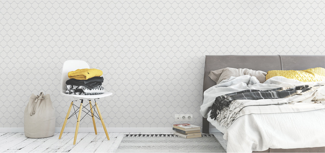
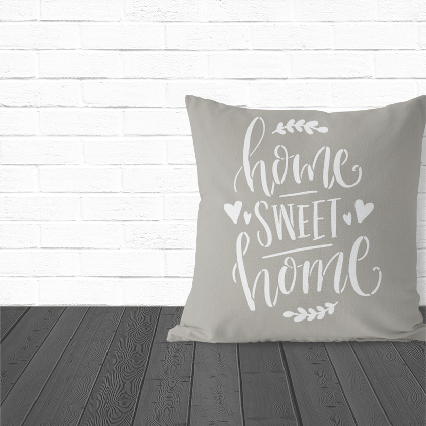
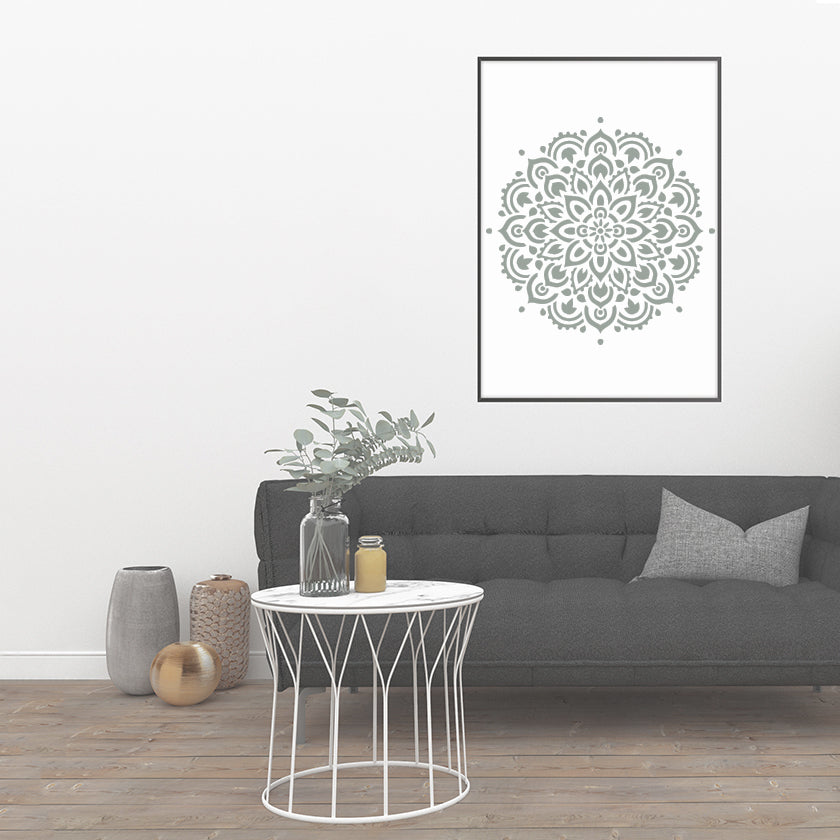

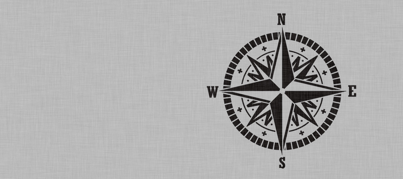
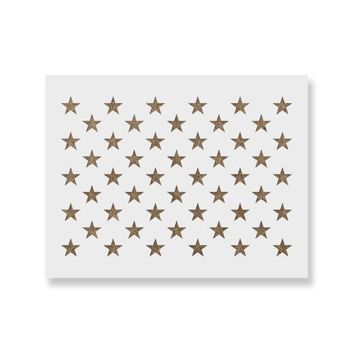
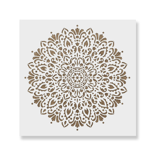
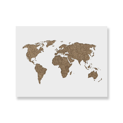
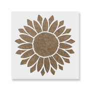
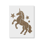
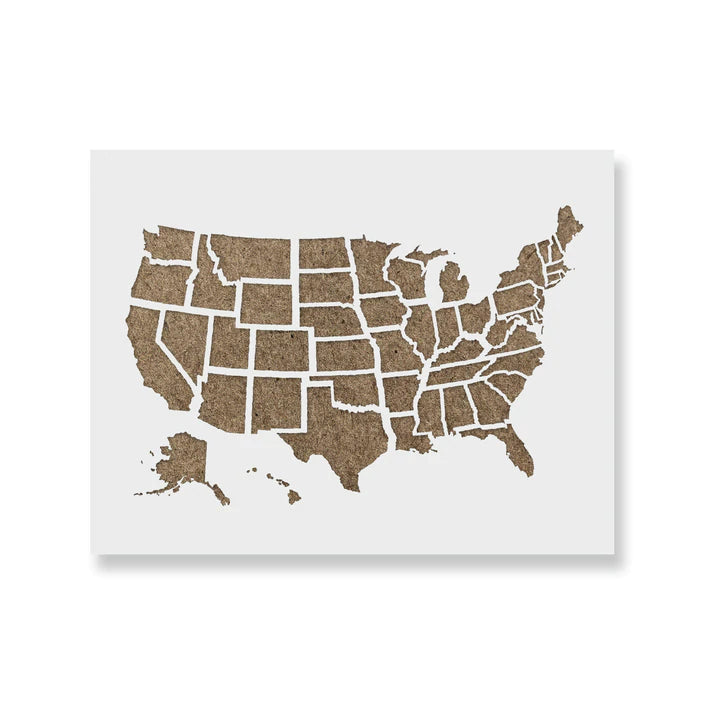


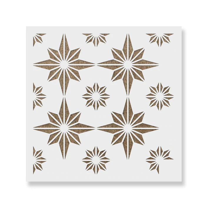
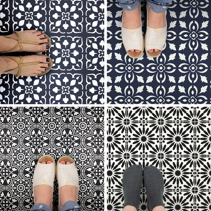
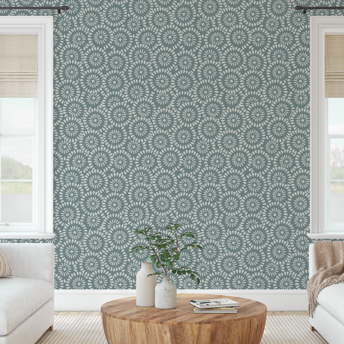
Welcome to Stencil Revolution! We offer a HUGE variety of reusable stencils for artists and crafters for all types. At Stencil Revolution we make ALL of our stencils right here in the USA with a laser cutter. You'll find over 1600+ different stencils for sale with up to 8 different size options to choose from. From highly detailed wall stencils to a variety of different mandala stencil designs, we've got it all. We also process all of our orders in only 1 business day. This is one area we’re extremely proud of. When you place an order, within 24 hours we’re firing up our lasers, cutting your stencil(s) and getting those babies in the mail! That means most domestic orders will be in your hands within 2-5 business days using standard shipping.
But don't just take our word for it! Our 20,000+ five-star ✨reviews are a testament to the satisfaction and joy we've brought to artists, crafters, and DIY enthusiasts alike. From professional muralists to passionate bakers, we've helped countless people add a touch of magic to their creations with our stencils.
Our material
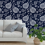
We use a 12 mil Mylar, it's the toughest, safest consumer-grade stencil material available. It's incredibly durable (tear proof) yet flexible enough to bend around surfaces if needed. Since Mylar is resistant to most solvents, it can even be washed with paint thinner! Our Mylar is also food safe, so it can be used for cookie stencils and baking.
12 mil Mylar, the superhero of stencil materials! Durable as the Hulk (tear-proof!) and flexible enough to bend around surfaces like Mr. Fantastic, it's the ultimate choice for stencil enthusiasts. Mylar's solvent resistance means it can even be washed with paint thinner – talk about invincible! Oh, and did we mention it's food-safe? Yep, you can stencil your cookies and bake your cake, too! 🍪🎂
Made with love in USA
We're a small family owned company based out of sunny Florida where we manufacture and ship ALL of our craft stencils. Every stencil we make is cut and packaged right here in the USA by one of our team. For us stencils are more than just a business. They are something we truly love and find passion in. We have to pinch ourselves sometimes because it really seems like a dream that working with stencils is actually our day job. And we get to play with lasers! This is all thanks to our amazing customers that enable our family to live a simple, purposeful life.
Need help?
We're not just stencil sellers, we're your creative comrades! We love connecting with our fellow stencil enthusiasts, sharing ideas, and celebrating your successes. Our friendly and knowledgeable customer support team is always ready to lend a helping hand, answer your questions, or simply chat about your latest stencil masterpiece. 🤗
At Stencil Revolution, we believe that creativity has no limits, and neither should you! Our mission is to inspire and empower you to transform ordinary surfaces into extraordinary works of art, one stencil at a time. So, join us on this spectacular adventure and let's create a kaleidoscope of colors, patterns, and joy together! 🌟🎉